Case study: grammarly checkout flow optimizations
Supporting the Growth team as the lead Content Designer through optimization beta testing cycles
My role: Senior Technical Writer and Content Designer – Design Foundations
About the project: Grammarly’s Growth Marketing team collaborated with the Marketing team on several check-out flow optimization redesigns through the spring of 2025. One such initiative was focused on streamlining a discounted rate checkout triggered by a paid search ad link.
Business objective: User testing as well as leadership review found that the specifics of the discount were minimized, crowded, and muddled as the user journey progressed from the initial ad click through the final purchase.
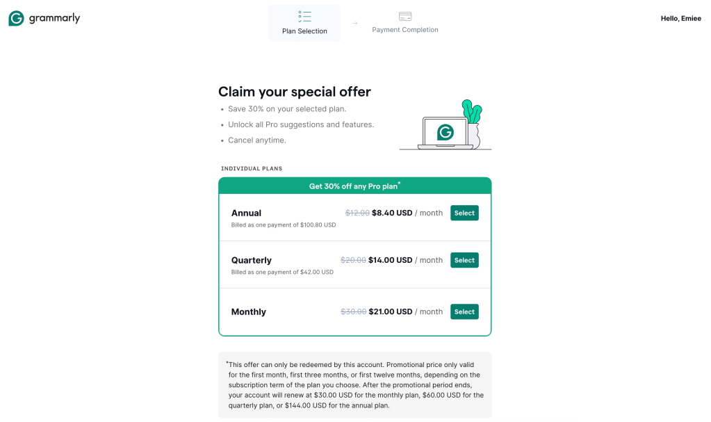
The primary goal was to emphasize how the discount was applied across the 3-tier plan options. Additionally, the content design needed to focus on clarity of detail and unification of wording from screen to screen.
This project would be deemed “successful” if there was an increase in completed Annual plan purchases of 15% or more.
Timeline: Each testing cycle lasted 6 weeks, or until statistical significance was reached. I supported the second testing iteration for the discount checkout optimization and the initial redesign iteration for the out of app purchase flow optimization. Both projects were happening simultaneously and with overlapping teams and research, but with vastly different timelines. I’ll be focusing on the discount checkout portion of the project specifically for this case study because in this case, I was the sole Content Designer on the redesign.
Challenges: Since the design of the checkout container was somewhat inflexible, and certain content blocks were managed directly by the marketing team, the biggest obstacles we faced were around finding ways to maximize the impact of the content, while having to be judicious and economical with wording.
This, importantly, couldn’t come at the expense of clarity or accessibility standards.
Working directly, rapidly, and often with the Growth Product Designer in Figma and 1:1 design sessions, we took the principles of user-first best practices, information architecture, design system parameters, and the integral guidelines from both UX research and our legal teams to design a more streamlined and accurate discount checkout flow. Testing and user feedback on previous versions helped set the guardrails, and examples of successes from elsewhere in the industry served as inspiration. However, when you put that all together, it kinda felt like a constant question of how many different ways are there to say, “Save 30%” after all?
Interestingly, for this project we were working with a brand new PM and prior to his arrival (which came at the same time I joined), the project was being overseen at the Director level. The changes had to be pitched, designed, through team critiques, reviewed by leadership, okayed by legal, coded, and shipped in under two weeks in order to get testing feedback and any adjustments made prior to an upcoming marketing moment.

Final Design:
- The Product Designer and I both advocated for the removal of further marketing copy in the container of the checkout flow (the part we had full control over) in lieu of a font sizing change to emphasize the discount. This also aligns with the broader design adjustments across the board, opting for more minimal, direct, and easier to read product copy.
- Additionally, we opted to rearrange the flow of text in the final screen to read in a more intuitive “F” pattern, with the final amount and CTA in the bottom-left corner – more closely resembling a receipt. This also helped to shift all the information above the fold on all possible screen sizes, which aligns better with standard industry practice and accessibility guidelines.
- The discount amount was emphasized in size, weight, placement, container, and color in the new design. This helped the discount pop on the screen. I also adjusted the wording around how this would reflect in the final amount to be more instructive, but still in plain language. Strikethroughs of non-discounted rates remained. Billing information was moved to under the billing cycle title in order to grant more space for the new discount container.
- The “Select” button was added back into the design, in keeping with best practices guidelines from the Design Foundations team.
- The subheading was changed to something which read more like common English since this was going to be tested on non-Enterprise accounts. I felt this better aligned with the brand’s voice and tone overall, as well, and advocated strongly for this adjustment.
- We opted out of altering other aspects of the design choices re: nudges toward Annual plans, etc., since we were already tweaking too many components in this iteration to be able to parse what could be working in the next round of testing to be sure.
Outcome: The project spec seemed to accurately predict what design changes would prove successful early in the testing flow. There was a 20% increase in Annual billing selection, as hoped for, already within the first three weeks of the test. By the time statistical significance was reached, it was clear this optimized flow was hitting the benchmarks of success.
These changes were tested and shipped in time for some big marketing moments across the organization. Hitting our tight deadline meant Growth + Marketing could capitalize on the testing research to better position products and plan updates in time for the huge back-to-school discount push at the core of Grammarly’s business strategy.
Since checkout flows across surfaces were undergoing a number of proposed changes in design, content, and marketing tests, the performance of this redesign was instructional for ongoing Growth redesigns beyond just the discount flow.
